2019-nCOV Graphs
Analyzing the Data for My Own Curiosity
I did this work to figure out for myself what is going on. The point of this work is to gain INSIGHT from data that is for the most part inadequate for drawing firm conclusions.
This page is under development. I’ll be adding new things as I explore the available data. I will put most new things into the blog. As more articles are written, I’ll put the better things onto this page.
Wisconsin Analysis
Animation of the spread of the confirmed cases in Wisconsin.
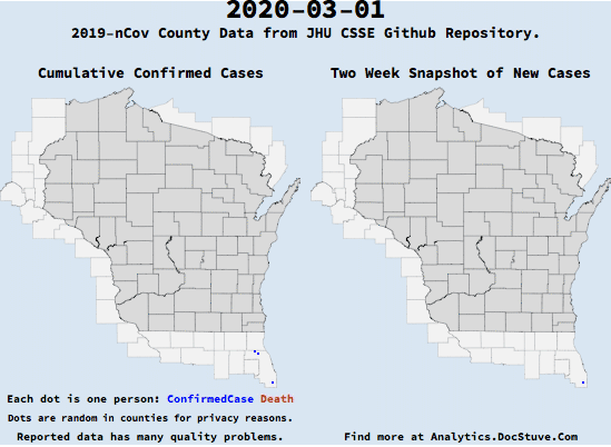
This shows the spread of confirmed cases. It is important to note that testing coverage and reporting was NOT consistent across regions and time stamps. Note that there is a couple of second pause at the end freezing on the last day.

This is a snapshot of various things. It’s meant to try to see a bigger picture than head line numbers. The dots on the maps each represent one case. The blue dots are confirmed cases and the red dots are deaths. The underlying data is inadequate to draw firm conclusions from. This dashboard is useful for seeing general trends and gaining insight as to what is happening.